Thursday, February 29, 2024

Getting a Jump on Things


Happy Leap Day, gentle readers. This 1956 Ace Books cover of Leap in the Dark, by former actress and editor Rona Randall (aka Rona Shambrook), isn’t being highlighted today simply because of its title. It also hints at a project I have upcoming on this page, which will begin soon and likely run through most of March.

Meanwhile, a few words about the paperback novel at hand.

My Love-Haunted Heart, Sara Boyle’s terrific (but, sadly, no longer updated) blog about vintage Gothic romance novels, describes Leap in the Dark as “an interesting take on the mistaken identity plot twist.” She then synopsizes its plot thusly:
Jeanne Cleary is on her way to nursing college in London and on a whim hops off the train in a remote village in France. The station’s deserted so she follows a dusty path through the countryside leading her to the local chateau.

By a strange (very strange) coincidence, nurse-to-be Jeanne finds herself mistaken as an actual nurse (due to arrive that very day) who had recently been hired to look after the lady of the manor, Comtesse de Clementeaux.

Just as Jeanne decides to find a convenient time to break the news to her new found granny, another girl turns up—declaring herself to be Jeanne Cleary, the Comtesse’s granddaughter! The real Jeanne knows this new interloper is just a gold-digging impostor, but how can she reveal her true identity without breaking her own cover? So a sticky situation turns into a quagmire of confusion as our heroine battles to assert her rightful position within her newfound family and win the heart of the handsome Dr Paul Antoine.
The handsome painting that fronts Leap in the Dark was created by Italian-born artist Lou Marchetti (1920-1992), whose work has appeared on this page many times over the years. Boyle quips that “extra points [should be] given for this cover, as it’s refreshing to see a heroine dressed in something other than a floaty nightie.”

If you’re thinking this portends a similar demureness in the cover series I have planned for next month, fear not. There will be plenty of diaphanous attire and bared skin to admire. Stay tuned.

Wednesday, February 14, 2024

Happy Valentine’s Day to You, Too!


A Time to Love, by Noel O’Hara (Chariot, 1960), which seems like an ideal cover to showcase this week, when both Valentine’s Day and Mardi Gras are being celebrated. Cover painting by Basil Gogos. Enjoy Gogos’ original art for the book here.

Tuesday, January 30, 2024

Another Look: “Miss Pym Disposes”

Warning: Artistic inspiration drawn from book titles may vary.


Left: Miss Pym Disposes, by “Josephine Tey,” aka Elizabeth Mackintosh (Pan, 1957), with a cover by new-to-me vintage artist S.R. Boldero. Right: Miss Pym Investigates (Pan, 1960); cover illustration by Sam “Peff” Peffer. Scottish author Tey (1896-1952) may be most fondly remembered for her half-dozen novels featuring Inspector Alan Grant (The Man in the Queue), but her two standalone mysteries—this one (originally published in 1946), and Brat Farrar (1949)—are no less deserving of attention.

READ MORE:Decades After Her Death, Mystery Still Surrounds Crime Novelist Josephine Tey,” by Francis Wheen (Vanity Fair).

A Nonagenarian of Note

New York-born painter and art instructor Jack Faragasso—“one of the cornerstones of paperback illustration art”—celebrated his 95th birthday exactly a week ago, on January 23. To honor that milestone, Michael Stradford showcases several of Faragasso’s pieces featuring once-ubiquitous paperback cover model Steve Holland in his blog.

You’ll find more of Faragasso’s work on the image-hosting Web site Flickr. Or click here to read an interview with the artist.

Monday, January 22, 2024

Going on 15


I love the above illustration, based on artwork by Barye Phillips. It’s appropriate to post in honor of Killer Covers’ 14th anniversary.

When I launched this blog on January 19, 2009, the first illustration I posted was the front from a 1960 Bantam paperback edition of The Three Roads, the fourth novel by author Kenneth Millar, who would soon begin publishing crime fiction under the pseudonym Ross Macdonald. The quote installed over that Phillips painting, however, comes from Macdonald’s The Wycherly Woman (1961), his ninth book starring Los Angeles private detective Lew Archer.

Writing three decades ago in Reason magazine, Wisconin academics Lester and Deborah Hunt observed that “Macdonald's concern with trouble is conscious and pervasive. ...
“Trouble” is his name for the destructive consequences that follow from human irrationality and viciousness (usually the former). The real trouble begins when we can no longer control the destruction we cause. A blackmailer appears in the aftermath of what seemed a perfect crime; or an illegitimate child shows up, bringing home to his lost father the consequences he has never faced. Things get out of hand.

Once a mistake is made, trouble follows with a logic as intricate and ruthless as algebra. It resembles the “justice” (
dike) in Greek tragedy, a cosmic force that the ancients believed restores an imbalance in nature created by wrongdoing. But trouble is not justice in our sense of the word, because it harms the innocent and the guilty alike. Trouble therefore must be stopped, and that is Archer’s task. He discovers who is criminally responsible for it, not so that retribution can be exacted for what they have done, but simply in order to have them locked up someplace where they can no longer harm others or themselves. The point is to bring the tragedy to an end before trouble has expended itself.
There are certainly ample troubles—of the individual, familial, and societal sort—in all of Macdonald’s two dozen novels, which is of course one reason they’re so memorable. Fortunately, fewer tribulations have beset Killer Covers and your humble host, which has made it possible to carry on so long and why we will continue to showcase vintage (and occasionally new) book fronts into the future.

Thank you all for joining us over these last 14 years!

Borack Captures Holland

Earlier today, Michael Stradford, the author of several books about ubiquitous American paperback cover model Steve Holland, posted a selection of captivating paintings by Brooklyn-born artist Stanley Borack (1927-1993). “He had a crisp, realistic style that captured emotion and movement convincingly,” Stradford writes of Borack. “As such, it makes sense that Steve Holland was his go-to model for many years of paperback and magazine cover work.” As Stradford concludes, they “made a dynamic team.”

Monday, December 25, 2023

And a Very Merry Christmas to All!

The Corpse in the Snowman, by “Nicholas Blake,” aka Cecil Day-Lewis (Popular Library, 1945). Cover art by H. Lawrence Hoffman.


Sunday, December 24, 2023

All the Rage

Literary Hub believes it has finally identified this year’s hottest book-cover design trend. Writes Drew Broussard:
The reign of the color-blob book cover has slowly come to an end over the last several years, and various pretenders to the throne have taken their best shot at being the next trend—sans-serif minimalism (The “Cusk”); brightly-colored paper-cut-out illustrations, usually involving women (The “Bernadette”); and of course, the perennial text-over-full-jacket-evocative-photograph (The “Prestige White Author”).

We’re here to report that a new contestant is entering the field in 2024 (or at least Knopf is really trying to make fetch happen). Folks, allow me to introduce … the Pastel Sky.
Click here to enjoy a small gallery of examples.

Meanwhile, The Book Designer cites its own 2023 dust-jacket art consistencies, including head shots of authors, “colorful vector illustrations,” water and river symbolism, and “busy backgrounds with bold typography.” That Web site’s editors somehow missed spotting the whole pastel sky thing, though.

Friday, December 22, 2023

Another Look: “Naked Fury”

Warning: Artistic inspiration drawn from book titles may vary.


Left: Naked Fury, by “Day Keene,” aka Gunnar Hjerstedt (Phantom, 1952), with a cover illustration by Jack Rickard. Right: Naked Fury (Berkley, 1959); cover art by Milo.

Friday, December 15, 2023

Manipulating Reality

Stock photography has become so ubiquitous on book fronts in recent years, that few people give it more than passing notice. But recently, while gathering info about forthcoming crime and mystery novels, I happened across a January release titled The Clinic, by Cate Quinn, that caused me to do a double-take. Not because the cover was anything special, but because part of the art used was so recognizable, it distracted me from caring about the story to be found inside.

Publisher Sourcebooks Landmark describes this book as “a thriller set in a remote rehab clinic on the Pacific Northwest coast, in which the death of a woman inside prompts her sister to enter the clinic as a patient in order to find the truth.” Its synopsis goes on to explain:
Meg works for a casino in L.A., catching cheaters and popping a few too many pain pills to cope, following a far different path than her sister Haley, a famous actress. But suddenly reports surface of Haley dying at the ... facility where she had been forced to go to get her addictions under control.

There are whispers of suicide, but Meg can’t believe it. She decides that the best way to find out what happened to her sister is to check in herself—to investigate what really happened from the inside.

Battling her own addictions and figuring out the truth will be much more difficult than she imagined, far away from friends, family—and anyone who could help her.
The Clinic’s dust jacket, with its wave-battered cliffs, recumbent fog layer, and towered Victorian edifice, certainly supports this yarn’s eerie intent. But its cover image combines at least two stock photos. And if you’re like me, it’s impossible to look past the fact that the supposedly threatening coastal institution is actually a Eureka, California, landmark that once seen, is not soon forgotten.


(Above) The Carson Mansion is far from the Pacific Northwest.


Located at the eastern extreme of Eureka’s historic quarter, the Carson Mansion was completed in 1886 for William Coleman Carson. A native of New Brunswick, Canada, Carson had ventured west in the early 1850s, hoping—like so many other young men—to get rich quick in the California Gold Rush. He stayed afterward to become one of Northern California’s first lumber barons. In the early 1880s, he commissioned San Francisco architect-brothers Samuel and Joseph Cather Newsom, who Wikipedia says “specialized in designing Queen Anne-style … homes with extravagant details,” to create a showplace residence for his family in the busy coastal town of Eureka. North Coast Journal, an alternative newsweekly serving California’s Humboldt County, says Carson allowed his architects “a free hand with the design. Redwood—the wood that had made Carson wealthy—was the obvious choice for the exterior, due to its ability to resist weathering and decay. But Carson also arranged to have quantities of tropical hardwoods imported from all over for the internal construction and decoration. … Carson arranged for a schooner to bring nearly 100,000 feet of white mahogany (primavera) from Central America. In addition, shiploads of Philippine mahogany and Indian teak complimented the exterior redwood.”

Carson died in February 1912, leaving what was reportedly a substantial legacy to his five children. In 1950, his elegant four-story, 18-room home with its very distinctive tower became the headquarters of the private Ingomar Club, its membership open then—as now—only to men. Although this structure was included in 1964 on the Historic American Buildings Survey, its club owners have chosen not to apply for its placement on the better-recognized National Register of Historic Places.

While it’s located not far from Eureka’s Arcata Bay, the mansion—labeled “a baronial castle in Redwood” by one national architecture critic—doesn’t perch on an ocean-fronting precipice, as The Clinic’s jacket suggests. Nor is it occupied by a facility for patients in desperate need of physical or mental rehabilitation, though I’m sure many Ingomar regulars find succor within its grand walls.

Friday, December 8, 2023

Mann, Oh Mann!


I’ve had the opportunity over my years as a journalist and book critic to interview a great many people. They’ve ranged from relative unknowns to prominent figures such as actor James Garner, Doonesbury cartoonist Garry Trudeau, Washington Post editor Ben Bradlee, jazz singer Sarah Vaughn, and architect-futurist Buckminster Fuller, as well as crime novelists on the order of Ross Macdonald, Robert B. Parker, Elmore Leonard, and Philip Kerr.

Not all encounters of this sort have gone smoothly, and scheduling difficulties have sometimes arisen. However, I don’t recall ever being so challenged in seeking to arrange an interview as I was when I tried to connect with Salt Lake City-area artist-illustrator Paul Mann (shown at right).

You may recognize Mann’s moniker from an article I posted last week about his work on the front of 
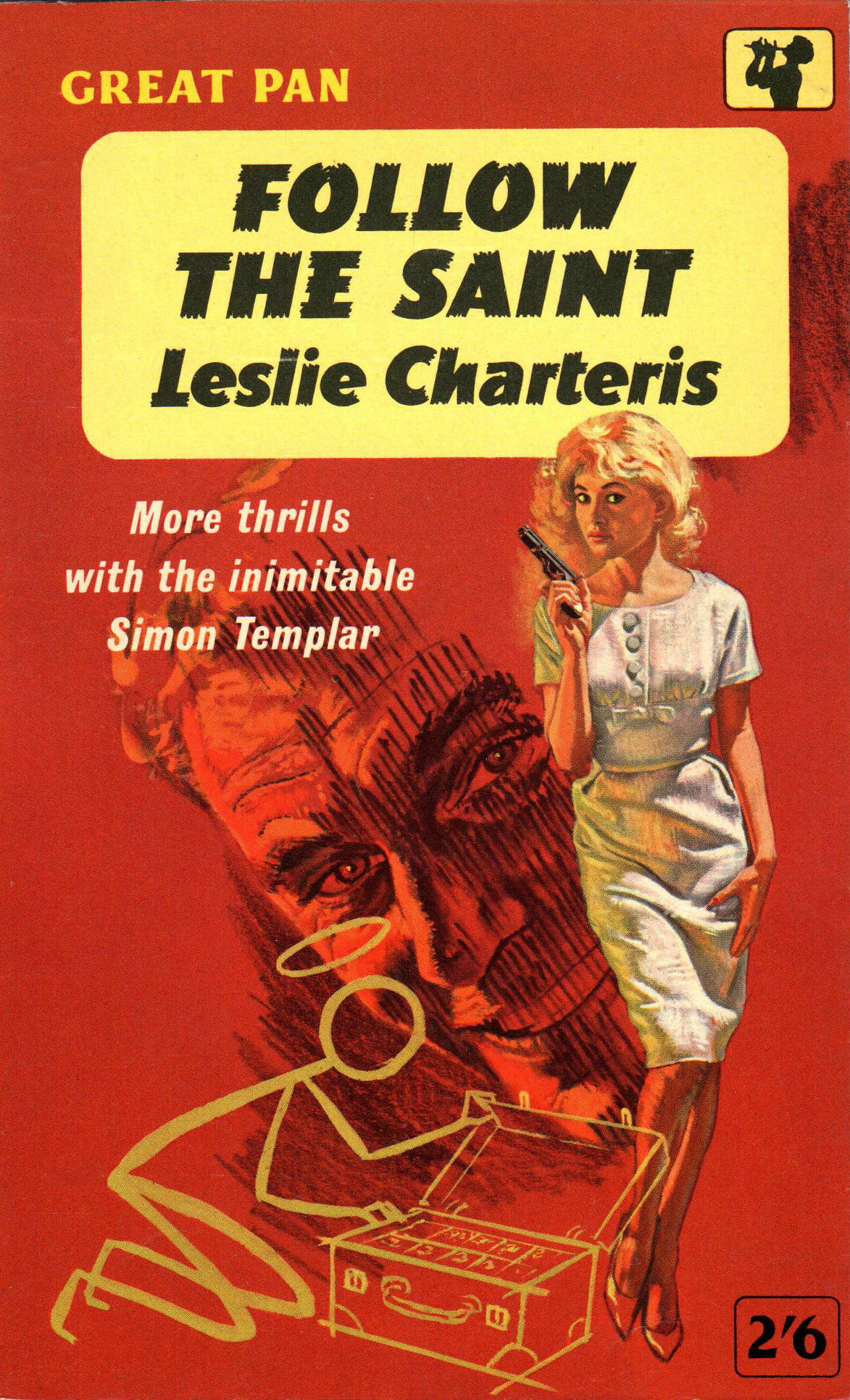
Too Many Bullets, the new, 19th Nate Heller private-eye novel by Max Allan Collins. Over the last half-dozen years, Mann has become a regular contributor to publisher Hard Case Crime’s cracking line of hard-boiled yarns. His mastery of retro-style imagery has made him a go-to HCC cover artist, along with Robert McGinnis, Ron Lesser, Claudia Caranfa, Mark Eastbrook, Laurel Blechman, and others. Having long been interested in book illustration, I wished to ask him about his four decades spent perfecting his craft, his creative techniques, his favorite book covers, his Hard Case assignments, and his extensive portfolio of cinema-related spec pieces.

When repeated efforts to make contact via e-mail failed, I asked Hard Case editor Charles Ardai for help in reaching Mann. Ardai said he was happy to pass along my message “with a note encouraging him to reply to you. He still might not—he’s a very nice fellow, but may not like doing interviews or might just be dealing with a lot of other commitments. But I’m glad to give it a try.”

In the end, I never heard so much as a whisper from Mann.

So I moved on. There were other people to speak with, other artists to showcase in Killer Covers, other book reviews to write. But recently Ardai mentioned on the social networking service formerly known as Twitter (sorry, I’m never going to call it “X”—that’s just too moronic a name) that Hard Case is planning next year to issue a trade paperback version of Lemons Never Lie, a 1971 novel that Donald E. Westlake released under his pseudonym Richard Stark. In 2006 HCC had published Lemons in mass-market size (with cover art by Richard B. Farrell), but copies of that ran out long ago, and as Ardai explained, Westlake’s widow “agreed we should reprint in the larger format to match all our recent editions of Don’s books.” Said forthcoming reprint will boast a new and captivating cover—exhibited atop this post—by none other than Paul Mann.

That finally kicked it over the edge. I was going to have to go ahead and exhibit Mann’s remarkable talents on this page without interviewing the man himself. Below you’ll find what I believe is his entire Hard Case oeuvre—so far. Among the titles are several by Westlake, including Forever and a Death (2017), which is said to have started out as a James Bond film treatment; Collins’ 18th Nate Heller historical tale, The Big Bundle (2022); Ardai’s Death Comes Too Late, a short-story collection due out in March of next year; and a 2019 illustrated edition of Stephen King’s The Colorado Kid (originally published in 2005 with a cover by Glen Orbik).

I look forward to seeing many more of Mann’s sexy, traditionally fashioned Hard Case Crime fronts in the near future.


Tuesday, December 5, 2023

Coffin, Coffee — What’s the Diff?

Back in March I posted (here) a Dime Detective magazine cover from 1943, promoting a story inside titled “You’re the Crime in My Coffee,” by D.L. Champion. More recently, I found the image below (from the March 1946 edition of Black Mask) in Pulp Covers, and at first glance thought its featured tale carried the same name. That was my mistake, but one that I’d argue was easy to make.

In fact, whoever wrote the original headline on Pulp Covers’ item about this issue front committed that same misreading!


(Above) Black Mask, March 1946; art by Rafael DeSoto.


The Thrilling Detective Web Site says that H.H. (Herbert Hunter) Stinson, the Illinois-born author of “You’re the Cream in My Coffin,” “was a Los Angeles police reporter and playwright, as well writing for the pulps. He was one of the original ‘Black Mask Boys’ (he’s actually one of the writers in the legendary 1936 photo), as well as one of the members of The Fictioneers.” Stinson wrote two main series of stories for the pulps: one for Black Mask, starring Ken O’Hara, “a hard-boiled reporter for the Los Angeles Tribune”; the other for Dime Detective, headlined by L.A. private eye Pete Rousseau. “You’re the Crime in My Coffin” isn’t listed as featuring either of those protagonists, so it may have been a standalone.

Mystery*File reports that Stinson was born on April 27, 1896, and died on October 9, 1969. He published at least one book, a 1925 Henry Holt & Company volume titled Fingerprints.

Friday, December 1, 2023

The Inconvenience of Abundance


It was while I was putting together a rather lengthy Rap Sheet interview with Iowa fictionist Max Allan Collins, most of which had to do with his new historical crime novel, Too Many Bullets (Hard Case Crime), that I realized just how many book fronts featuring those words “too many” can be found in my computer files.

Too Many Bullets, the cover of which is displayed atop this post (with art by Paul Mann), is the fifth entry* in a sort of mini-series within Collins’ string of 19 novels starring hard-boiled, Chicago-based private investigator Nate Heller, all of them in some way featuring John F. Kennedy and/or his younger brother Robert F. Kennedy. Bullets imagines the ubiquitous Heller on hand at Democratic U.S. Senator Bob Kennedy’s 1968 slaying in Los Angeles, and then follows him as he endeavors to untangle a conspiracy meant to pin that headline-grabbing tragedy on “lone gunman” Sirhan Sirhan.

When I typed “too many” into the search window of my computer’s Picasa image viewer, looking from the jacket of Too Many Bullets—surprise!—more than one cover came up. Not just Collins’, but also the fronts from 10 other novels, none of which I remembered downloading or storing away for future use. There was the 1962 Bantam paperback cover of Rex Stout’s Too Many Clients (with art by Bill Johnson), as well as the fronts from two other Stout works: Too Many Cooks (Dell, 1951; art by Robert Stanley) and Too Many Women (Bantam, 1949; art by Hy Rubin). In addition, I found Too Many Murderers, by Manning Lee Stokes (Graphic Mystery, 1955; illustration by Clyde Ross); One Murder Too Many, by George Harmon Coxe (Pyramid, 1967; artist unidentified); Too Many Beds, by “Tony Calvano,” aka Thomas P. Ramirez (Nightstand, 1961; artwork by Harold W. McCauley); Too Many Sinners, by Sheldon Stark (Ace, 1954; artist unidentified); Too Many Crooks, by Richard S. Prather (Gold Medal, 1956, featuring a Barye Phillips illustration); Too Many Women, by Milton K. Ozaki (Handi-book Mystery, 1950; artist uncredited); and finally the third Too Many Women tucked into in my files, this one by Gerry Martin (News Stand Library, 1950; art by Syd Dyke).

There are probably still more vintage books to be found with such titles. I shall add to this post as I stumble across them.


* The previous four books were Bye Bye, Baby (2011), which found Heller probing “blonde bombshell” Marilyn Monroe’s sexual involvement with both Kennedy siblings, at the same time as he sought to determine whether it was really suicide that sent the actress to her grave in 1962; Target Lancer (2012), which revisited a plot to do away with President Kennedy in Chicago in 1963—even before his tragic public slaying in Dallas, Texas; Ask Not (2013), about a succession of suspicious deaths in 1964, involving witnesses to President Kennedy’s assassination; and Better Dead (2016), in which Heller got better acquainted with Bobby Kennedy, while he investigated the case of Julius and Ethel Rosenberg, a New York City couple convicted of espionage for having reportedly leaked U.S. nuclear secrets to the Soviet Union.

Friday, November 17, 2023

A Tale of Paperbacks and Predators

(Above) Assignment—Moon Girl, by Edward S. Aarons (Fawcett Gold Medal, 1972), part of his Sam Durell espionage series.


Roger Kastel, who created the artwork for two of Hollywood’s iconic film posters and painted a variety of collectible paperback book covers, passed away on November 8. He was 92 years old.

In its obituary, Deadline recalls that
Kastel’s best-known work included imagery central to the posters for Jaws and The Empire Strikes Back. He also illustrated vivid book covers for the likes of John Steinbeck’s East of Eden, Jackie Collins’ Hollywood Wives and H.G Wells’ The Invisible Man.

His
Jaws illustration was originally created for Peter Benchley’s novel on which the film was based. Describing the process of its creation, Kastel remembered, “I did a very rough sketch, and [the publisher] said, ‘That’s great, just make the shark realistic and bigger. Make him very much bigger!'”

It worked. Benchley’s book was a bestseller and Universal [Pictures] execs, knowing a good thing when they saw it, used Kastel’s art in the movie poster.
Born in White Plains, New York, on June 11, 1931, he went on to graduate from White Plains High School, attend the distinguished Art Students League in New York City, and then serve for four years with the U.S. Navy during the Korean War. His Web site says Kastel had begun drawing cartoons in his teens, but finally “sold his first [paperback cover] illustration in the early 1960s and illustrated paperback book covers and movie posters over the next forty years.” It’s said that during his career, Kastel produced more than 1,000 illustrations for the major book publishers in New York.

But it was his ominous painting for the front of the 1975 Bantam Books paperback reprint of Jaws that earned him international acclaim. When Universal reused that illustration on its movie placard, it reportedly marked “the first time that a poster image became a merchandising product in itself.” The Jaws gig also scored Kastel the commission to create the publicity poster for George Lucas’ 1980 Star Wars sequel, The Empire Strikes Back (a creation he based on classic Gone with the Wind artwork). In addition, says The Hollywood Reporter, Kastel “came up with the posters for such other films as Doctor Faustus (1967), starring Richard Burton and Elizabeth Taylor, and The Great Train Robbery (1978), starring Sean Connery.”

Roger Karl Kastel was a long-standing member of the Society of Illustrators, and his talents were recognized in books such as 200 Years of American Illustration, by Henry Clarence Pitz (1977), and The Illustrator in America: 1860-2000, by Walt Reed (2001). He died of kidney and heart failure at a hospice facility in Massachusetts, leaving behind his wife of 66 years, the former Grace Trowbridge.

I showcased a number of Kastel’s book covers in a piece I wrote some years ago about the 40th anniversary of Jaws’ big-screen debut. But another one (Assignment—Moon Girl) is to be found atop this post, and below are two more I happened across more recently: The Skeleton Coast Contract, by Philip Atlee (Gold Medal, 1968), and A Woman Called Fancy, by Frank Yerby (Pocket, 1966).


You should also enjoy reading this interview Michael Stradford conducted with Kastel while he was researching his 2021 book, Steve Holland: The World's Greatest Illustration Art Model.

Thursday, November 16, 2023

Rearguard Action


I remember hearing somewhere about all the hoo-ha that surrounded the release of Johanna Lindsey’s 1985 historical romance, Tender Is the Storm (Avon), but never sought additional information. Fortunately, Tim Hewitt, who I’ve described previously on this page as “a former tech writer and ‘web monkey,’ now an ardent paperback collector” in South Carolina, looked further into the controversy. As he explained in a Facebook post earlier this week:
This one created a storm upon publication with some distributors and bookstores thinking the cover was too much. (“Female nudity good; male nudity bad,” I guess.) Subsequent printings placed a big sticker, proclaiming the book to be a bestseller, over the fellow's nether regions to protect the delicate sensibilities of reader ladies (and puritanical indignation of others) everywhere. There are several variations of the “sticker” (apparently including a printing with a Speedo of sorts superimposed on the hero’s hips). I don't know, but some later shipped copies of the first printing may have gotten an actual sticker slapped on the cover.
The blog Sweet Savage Flame, which specializes in old-school romance novels, offers some further background on this standalone paperback, as well as a couple of examples of stickers used to conceal the buff gentleman’s derrière in later editions.

Oh, and if you think that cover art looks like the work of Robert McGinnis, you’re right! It was just one of the steamy Lindsey novels to which he lent his talents—several others of which likewise featured male subjects in states of dishabille.

Digitizing Dames

Robert Deis, one of the principal editors responsible for getting The Art of Ron Lesser Volume 1: Deadly Dames and Sexy Sirens before the reading public this last summer, tells me that a “Digital Replica Edition” of that beautiful book is now available.

I was privileged to have a long interview I did with renowned paperback-cover art Lesser featured among the work’s contents.

“A Digital Replica Edition like this is not a standard e-book,” Deis explains. “It’s a high-resolution electronic copy that looks great on an iPad or computer screen.” The Kindle version can be purchased from Amazon for $12.99, but it’s apparently free to Kindle Unlimited members. That makes it the least expensive version to be had of Deadly Dames and Sexy Sirens; the original, hardcover edition goes for $49.99, with the paperback priced at $39.95.

Wednesday, November 1, 2023

A Treasury of Templars

The Saint in Miami, by Leslie Charteris (Avon, 1958).
Cover illustration by David Stone.


Is it mere coincidence that Halloween, which so often celebrates haunting and horrific characters, should be followed by All Saints’ Day, honoring “saints both canonized and unknown”? This Christian solemnity began working its way onto the liturgical calendar in the 9th century A.D., and was pegged to November 1 through the efforts of Pope Gregory III in the early 8th century.

But, of course, we have our own, non-religious interpretation of what sort of saint is really deserving of praise today.

That’s right, we’re talking about Simon Templar, alias “The Saint,” a Robin Hood-like protagonist who was introduced by British author Leslie Charteris in his 1928 novel, Meet the Tiger. Templar went on to star in three dozen more novels and short-story collections by Charteris until 1963. After that, other writers either collaborated with Charteris on Saint works, or—following the author’s death in 1993—penned Saint tales on their own. In addition, the hero featured in big-screen films as well as TV movies, and was portrayed by actor Roger Moore in a 1962-1969 ITV-TV spy thriller series titled simply The Saint. (A subsequent show, Return of the Saint, was broadcast from 1978 until 1972 and found Ian Ogilvy in the lead role.)

Below you will find covers from half a dozen Saint titles published during the 1950s and ’60s. We don’t have identifications of all the artists responsible for these. However, we can tell you that Charles Binger created the front for The Saint to the Rescue (Permabooks, 1961), George Ziel was responsible for Concerning the Saint (Avon, 1958), and Raymond Johnson produced the artwork for the edition shown here of The Saint Steps In (Avon, 1954).

Many more Saint paperback fronts can be enjoyed here.